“Jackapoo Pup with her Doughnut” [9th April 2024] by Matt The Unfathomable Artist, sketch on A4 mixed media paper, 5970 x 4788 pixels in cropped image for publishing.
My sketch “Jackapoo Pup with her Doughnut” is from a family photograph by my cousin of her adorable pup, now an energetic young dog. The prior week of making this artwork I saw this family dog happily in the garden with her doughnut.
The first draft took me 23 minutes 7 seconds and quite lovely already after the first draft. The second draft tidied at 6 minutes 16 seconds. Then a final draft of 8 minutes 8 seconds, an afterthought with a few finer details. 37 minutes 34 seconds in all.
Whilst I haven’t posted the original photograph it really is a very good likeness. The sketching is definitely my own style.
I made three fun digital versions of which ‘Silvered’ shown below is my favourite of those:
“Jackapoo Pup with her Doughnut – Silvered” [9th April 2024] by Matt The Unfathomable Artist, 100% Digital Artwork, 5970 x 4788 pixels.
Along with the original sketch I feel “Jackapoo Pup with her Doughnut – Silvered” is a strong piece of its own merit. I can envisage this artwork pressed onto metal such as aluminium, copper or even silver.
The process would likely include garlic juice and oil paint. Finishing the piece with a gold frame.
”Painted Organism #1 in Red” [digital Art, 13th September 2023] by Matt The Unfathomable Artist, 100% digital artwork, 1920 x 1080 pixels.
Original quote: “This is a doodle for fun. I made this digital artwork quickly in around an hour. There are eight versions in total including the Original in Red.”
I carefully selected from the eight versions to publish four of my favourites.
”Painted Organism #1 in Monochrome” [digital Art, 13th September 2023] by Matt The Unfathomable Artist, 100% digital artwork, 1920 x 1080 pixels.
”Painted Organism #1 in Monochrome” is spectacular.
”Painted Organism #1 in Vivid Green” [digital Art, 13th September 2023] by Matt The Unfathomable Artist, 100% digital artwork, 1920 x 1080 pixels.
”Painted Organism #1 in Vivid Green” has an emotive sense, do you agree?
”Painted Organism #1 in Yellow” [digital Art, 13th September 2023] by Matt The Unfathomable Artist, 100% digital artwork, 1920 x 1080 pixels.
The subtle softness of ”Painted Organism #1 in Yellow” is calming.
Even now, several months after creating these digital Editions using readily available professional painting software, I enjoy the organic realism to the pieces.
Every line and tone is freehand drawn using a mouse.
The pieces were inspired by the style of a past artist which included Cells.
“Green Umber Gold Rectangular – Solar Landscape” [5th April 2024] by Matt The Unfathomable Artist, 100% Digital Artwork, 4695 x 3541 pixels.
I made two digital Editions of Green Umber. “Green Umber Gold Rectangular – Solar Landscape” shown above.
This particular Solarscape (as I term this type of digital work) is quite nebula-like. Always interests me how my brushstrokes and palette work converts attractively into a digital representation. From there I make finite adjustments to arrive at a unique piece.
Next, I have a Portrait Edition, fine tuned today:
“Green Umber Gold Rectangular – Monochrome Portrait” [18th April 2024] by Matt The Unfathomable Artist, 100% Digital Artwork, 2252 x 2987 pixels.
“Green Umber Gold Rectangular – Monochrome Portrait” bursts through with lightin a vertical edition, similar to the Original abstract painting itself.
Businesses use technology constantly to communicate directly to an audience.
The use of technology helps artists achieve much greater exposure to viewers than ever before. For me the creative elements within technology offers new scope for making art.
I do feel these two digitals are valid artworks in their own way. In my early digital experimentations I made some artworks in an explorative manner only, merely to share with you.
Pieces like these in this article would certainly look super printed and installed in any suitable setting.
I think I am saying some pieces are for online enjoyment and personal exploration. Whilst I feel most of my digital artworks are potential installation pieces.
I would love to create an art museum of my works for your enjoyment.
“RAW OME – Original” [16th April 2024] by Matt The Unfathomable Artist, Iron Gall Ink drawing on A4 250g mixed media paper, 4189 x 5814 pixels.
I made “RAW OME – Original” within approximately half an hour, completely spontaneously without any preconceived ideas. It should be noted this was done with a dip pen with a sharp flat metal nib.
Every line, rounded shape, written word and iconography required repetitive ink dipping to create the stark, clean workpersonship you see here. I use an original boutique made recipe in good reference to an oak gall ink by Giovambattista Palatino from the mid-1500’s.
In addition to the Original ink edition I made two digital versions ‘Silver Bullet’ and ‘Brimstone’ shown below which feature black backgrounds. These digital artwork titles play on menthinking of divine retribution to manmade problems, like manmade war.
“RAW OME” incorporated some of my Galaxies Reverberation symbology in its [subconscious] construction [G.R. #7 #8 & #9 featured]. nb see also Galaxies Reverberation #1 & #2 and Galaxies Reverberation #6 whose titles all reference <cause and effect> and <chaos theory>. ‘Chaos’ Theory in the way I understand this. That is to say an occurrence can, at certain times, be interconnected to another.
In this intellectual reasoning therefore both cause and effect and chaos theory have pertinence with my latest artwork, “RAW OME”.
Yes, this is 100% derived from topical international news. It is genuinely ‘completely spontaneously without any preconceived ideas’ in that I just drew lines and shapes. Becoming the news as I did so, now in my thoughts. After completion I myself realised the ‘squiggles with DEMOLITION’ area of the paper actually represented something specific!
Humanity.
This sliver of ink itself not conceived as an idea in any way whilst drawing, aside from the obvious connection to war generally.. demolition. An overt movie reference.
I leave no ambiguity with some things. RAW OME is quite simply ‘WAR MEMO’.
A diplomatic capacity.
Last night I looked up the word OME. I had no prior idea it was even an individually recognised word or words in any connotation or scientific meaning whatsoever. This formula to obscure word or words is entirely Basquiat inspired.
SAMO is merely a play on words only.. to sound–like ‘same old’.
Noxbuilds upon hierarchical mens inability to appreciate their wanton ruinous Earth-wrecking actions.
The aghast hands parody their critical analysis of the situation.
Other hierarchy must be evil. They cannot possibly believe how their enemies could react so co-equally recklessly also.
This artwork is not about good or righteous actions. It’s about recklessness. Recklessness sharpening missiles against recklessness.
Cause and effect.
A business in cunningly orchestrated war at the detriment of national debts, cost of living, your personal well-being, safety and security.
50 + 50 + 50 = DStM.
“RAW OME – Brimstone” [16th April 2024] by Matt The Unfathomable Artist, 100% Digital Artwork, 4189 x 5814 pixels.
As already mentioned “RAW OME – Brimstone” is all about the onerous thinking that God wants to eliminate co-competing nations or their peoples. Some or all of whose people will believe in God. Some of whose people will not.
That is free will.
“RAW OME – Silver Bullet” [16th April 2024] by Matt The Unfathomable Artist, 100% Digital Artwork, 4189 x 5814 pixels.
“RAW OME – Silver Bullet” leaves the option of simpler solutions to complex problems.
Of course, we do not live in a perfect world where everyone will chat nicely to solve bitter disagreements amicably with a cup of tea.
Unreasonableness is a problem.
Evil is a problem.
Without selfish unreasonableness the global manmade climate damage problem would be much further along its most timely reversal.
I wrote this impartially without prejudice for all people.
“Gold & Blue Abstract after Rothko” [April 2024] by Matt The Unfathomable Artist, acrylic fine art painting on 24cm x 18cm canvas board, 3534 x 4794 pixels.
Quotes #1 and #2:
#1 [ these two art made (*1a) tonight. the gold one was very difficult to make. i tonked it after the second (yet first) draft. then i made it (even more) perfect again. it was originally two squares. the blossom one was an instant joy over two drafts. both i shall gift. one i know to whom, for difficulty became joy. the other i am as yet not knowing to whom. ] – April 2024.
#2 [ The central two squares I am referring to looked like my digital artwork “Dusty Glass Greenhouse” [see next image for this artwork (*1b) yet in gold and yellow ochre. After I finished “Gold & Blue Abstract after Rothko” I knew I had made an artwork to be very happy with.
A strong happiness having achieved my first 100% Rothko style!
For those interested in my process I became immensely focused with every single palette knife movement, the canvas textures and uniformity of the entire piece.
Please note I have included the natural light cast upon the canvas at the time of photographing for you to enjoy the gallery experience of seeing a physical canvas. ] – 2nd April 2024.
(*1a) these two art made refers to “Gold & Blue Abstract after Rothko” and “Cherry Blossom Abstract after Rothko”.
“Gold & Blue Abstract after Rothko” exhibits a handsome man’s face in the manner of a Greek god (Apollo perhaps?) or even Christ! Pure chance, 100%. It is best at approximately 10 to 30 degrees left of the image, in my opinion, to see this in a specific lighting effect. Hence somehow not yet fully understanding why.. I managed to title this as a Rothko.. in style of course!
The beautiful face.
Some kind of abstract genius to the work.
It really is very beautiful with a strong nose in a stylistic representation you appreciate. Not until in Pagani-like viewing of this work did I notice on that evening with my reading lamp on. True.
The shadow in my photograph above casts a shadow upon the face itself. With the correct light whilst viewing it adds further detail to the face. Quite extraordinary.
If this is difficult to fathom.. there is also a believable lion’s face in my “Cyan Palette Nebulae” in addition to an ‘alien-like woman’ face. Yes, freakeh for a certainty with both artworks. The latter probably took me not twenty minutes with completely random paint drips and quick palette work on the wet canvas.
(*1b) by the way is one of my “Dusty Glass Greenhouse” digital artworks here:
“Dusty Glass Greenhouse – City 3D” [digital Art, 7th September 2023] by Matt The Unfathomable Artist, 100% digital artwork, 1920 x 1080 pixels.
For Variations of my “Dusty Glass Greenhouse” series works I have included these after the abstract acrylic paintings in this article, see further below. Please do click on images to see close-up details.
Next is abstract acrylic painting “Yellow Gold Rectangular Masterpiece”:
“Yellow Gold Rectangular Masterpiece” [4th April 2024] by Matt The Unfathomable Artist, acrylic fine art painting on 24cm x 18cm canvas board, 3000 x 4058 pixels.
Quote:
[ I made three miniature canvas artworks (*2) on the same draft evening session. This yellow gold work is the first piece, completed in minutes to be honest.
The second piece was also completed in minutes, whilst the third is still in the decision making process.
The third artwork has two exceptional digital works derived after its second draft session of 5th April. It looks like an abstract bank note I guess, unpublished for now.
As for “Yellow Gold Rectangular Masterpiece”.. it is so perfect it’s difficult to believe how quickly I made it.
A genuine love at first sight artwork in every way. ] – 5th April 2024.
The framing area of this artwork was delicately intricate for me to do. As for the palette knife work, like “Cherry Blossom Abstract after Rothko” the palette work was quite effortless really. Everything just placed nicely.
It might sound silly to some, I was ecstatic after “Yellow Gold Rectangular Masterpiece” in all soberness. Holding the artwork, as I have just now whilst writing, I love the piece so much. With this and “Gold & Blue Abstract after Rothko” I feel I made genuine ground with depth in the spirit of his style.
I have viewed all these acrylic abstracts every day to-date since making them.
(*2) the three miniature canvas artworks quoted on the same evening are “Yellow Gold Rectangular Masterpiece”, “Cyan Palette Nebulae” [as yet unpublished to WordPress] and “Green Umber Gold Rectangular Abstract” see image immediately below:
“Green Umber Gold Rectangular Abstract” [4th/5th April 2024] by Matt The Unfathomable Artist, acrylic fine art painting on 24cm x 18cm canvas board, 2252 x 3000 pixels.
Quote:
[ It took some time for me to be happy with the canvas appearance for this green umber gold work.
Interestingly I painted with the gold to the left in landscape situ (prior to adding the gold of course!). I prefer the way it is displayed here in portrait with the gold at the top, although I do like the landscape view also.
The gold was added after the green and umber was first defined due purely to aesthetic canvas spacing.
The painting has a deep affect through its harmony of paint layers. ] – 6th April 2024.
nb I painted this in landscape situ also after the gold line was added.
It’s a love or loathe artwork I guess?
Like or dislike it actually received the most working hours by me! Particularly since the other two abstract acrylic artworks of the evening took minutes, being happily finished in an evening.
You will most likely love this artwork if you see the physical canvas, just like “Gold Squared Green/Gold Tile” (btw as regards Gold Squared it needed that further draft, honestly, ‘If so‘ you preferred the first draft of the latter).
I worked on “Green Umber Gold Rectangular Abstract” the next day (5th April).
< Can I just say it’s 0230hrs UK. Three hours ^^ since beginning to write/produce this article, non-stop. The rest of the article is already written and in the edit. I am writing these <> words whilst proof-reading, quite tired. My half glass of a vintage 2020 grape wine variety has long gone. Yes, I want another half or full glass even. However it’s far too late, I need to sleep. Obviously. Drank from my heavy crystal decanter glass gifted years ago by my Nan and Grandad, both passed. >
Every worthwhile artist who is reading this knows we must be happy with our artistic work. A finite orangey rectangle was added around the green, after the (now top) gold line. Smattering of gold paint is added into the central canvas too. In approximately three or four areas. Blended-in, all except one (lower-left in portrait image).
Having reviewed the piece.. it.. needs.. light.. to make it come alive. Most all my works do.
I set out to be a master of light. Modestly I write.
The central gold is very subtle. I was sort of obsessed getting it ‘correct’ to be honest. In terms of paint layering technique this one is likely closest to the way Rothko built his individual canvases, I would guess.
The layering is sophisticated.
I do not view “Cyan Palette Nebulae” as Rothko in style whatsoever.
My own works in the Rothko style refer to colour theory and spiritual sense over exactly emulating his canvases. I do play on the rectangular shapes though, as we see in my next newly WordPress published piece:
“Cherry Blossom Abstract after Rothko” [April 2024] by Matt The Unfathomable Artist, acrylic fine art painting on 24cm x 18cm canvas board, 6258 x 8383 pixels.
“Cherry Blossom Abstract after Rothko” is all about colour theory and emotion.
I have seen and you can think its mad if you like..
An elephant with its trunk
A heart (of the emoji and classical symbol shape)
A bushbaby
An ‘M’. LAUGH please. I see an ‘M’ in practically everything as you probably all know by now (*3)
Do click on the image for yourself.
(*3) btw I actually took a photograph late afternoon 14th April of an ‘M’ in the fabric of my cargo pants. LAUGH. Oh gosh.. louder than that please haha.
Anyway, I made Cherry Blossom quite quickly without any abstract shape ideas whatsoever. Stick your tongue out if you want, if you feel I write like a kid.
Please believe me. I only concentrated upon colour contrasts. In this I was very happy with the result.
Next up, roll up, we have:
“Dusty Glass Greenhouse – Burgundy Red 3D” [digital Art, 7th September 2023] by Matt The Unfathomable Artist, 100% digital artwork, 1920 x 1080 pixels.
“Dusty Glass Greenhouse – Burgundy Red 3D”.. cool digital art, you agree?
This one is the Original digital artwork, the first. I posted City 3D to Instagram for its dynamic colour range. It’s style is part of a theme I had/have for microscopic organisms.
I will feature the original “Painted Organism #1” with its Variants at the earliest. Having made such a prolific number of 100% digital artworks at that time I just couldn’t publish everything immediately.
Please let me know how I did with my proof-reading, grammatical construction and interconnectivity.
“Green Scratchpad” [29th March 2024] by Matt The Unfathomable Artist, acrylic fine art painting on 280gsm 10in x 12in gesso primed canvas, 3000 x 3459 pixels.
Here I am catching up documenting works to my WordPress. To my count I have seven unique works to include after “Green Scratchpad”. Five paintings, a sketch and digital art photograph.
For some reason I felt compelled to paint artwork following artwork the evening of 29th.
Gorgeous green paint!
Here is a quote I posted to my Instagram about “Green Scratchpad”:
[ i made three beauties tonight. this is one of them, Green Scratchpad (i scratched two tiny pink spots out the canvas lol) although i called it that before i knew i would! its utterly perfect even if i say myself . Cy Twombly inspired obv. i am hoping to gift this one ]
Interestingly after scratching out two pinkish dots top-right and lower-left I noticed one pinkish dot in the scratchpad itself, mid-right inside the palette knife scratch lines. That one is now happily part of the piece.
The piece exhibits subtle pinkish-red, cyan and yellow flecks. I mixed the green paint from red and blue acrylic originally intended for “Pink Monument Abstract”. “Green Scratchpad” is made very quickly and intuitively.
The paint lines were scratched differently to the two pink dots I removed from the canvas. For clarification if anyone wishes to know, the dots scratched out is (1) the clear white canvas highlight top-right and (2) a less noticeable highlight lower-left.
Pure chance unintended placement since these somehow made their way onto this canvas following work on my first painting of the evening “Pink Monument Abstract”.
At the time of making “Green Scratchpad” I had no preconceived ideas. None. Zero. Not even a title. I generally title works after they’re made anyway. So true since I titled this “Scratchpad” at first upon completion. Changing the title only to reflect the gorgeous green I made.
Furthermore I did have a thought. What if I made different versions of this in a multitude of colours with its own individual scratching design?
Art my friends is a personable production.
That said some people knowing my life will appreciate that again, subconsciously, I am spontaneously drawing upon interconnected conceptual themes. For a clue here is another artwork I made in subconscious thought.. “Conkers of the 2021 Season”.
I was over halfway to etching lines into the green canvas when I realised a possible connection to..
.. numbers.
My favourite part of the canvas is probably the IM you can see at the mid-lower-right. 100% pure chance as the detailing of the right-vertical ‘soundbar‘ is completely random! So random I only just made up the idea to call that a soundbar whilst writing these literal words at 1924hrs.
IM (to me) means I AM. Me. The person of myself.
By the way certain elements in this piece remind me of movies! Movie studios producing specific movies. Why? Black and white action films I watched as a boy.
I can tell you having finished this work very quickly it felt great. An achievement of creativity and quality art making.
During canvas working and afterwards a particularly famous master artist in my thoughts.
Please note this artwork is gifted. I shall send this to them at best convenience with how I see its framing. Of course it is entirely their choice how they do so.
“Pink Monument Abstract” [29th March 2024 @ 1948hrs] by Matt The Unfathomable Artist, acrylic and red wine abstract art painting on A3 300g mixed media paper, 4197 x 3000 pixels.
I haven’t experimented enough with feminine associated colours. “Pink Monument Abstract” is much palette knife work with a high quality soft-looking (on the canvas) gold paint. I added seismic/sound waves to the top for personal authenticity in my work.
Did it look like a series of ‘M’s also.. yes? Oh goodie.
Wavy palette lines art delicious I think. The central monument idea could be ark-like; burial/archaeological site in reference; haystack/field orientated; trinket box; ancient Egyptian or even alien symbology.
Or something else you personally like. My monument artwork series is all about imagination.
On that evening I made “Pink Monument Abstract” first, “Pseudo Purple with Gold Frame” next and then “Green Scratchpad” lastly with the remaining mixed green paint I produced.
“Pseudo Purple with Gold Frame” [29th March 2024] by Matt The Unfathomable Artist, acrylic abstract art painting on A3 300g mixed media paper, 3000 x 2136 pixels (low-res image only for online publishing)
With “Pseudo Purple with Gold Frame” I repurposed an A3 paint marked paper canvas in true abstract style. You can clearly see my palette knife lines here in the green. Rarely do I show these lines so obviously, as for some it might be considered not quite so sophisticated?
Here I felt they were and are beautiful untouched with a rawness. The high quality gold shines without any further painting or material complications.
To be honest I am delighted with these results including “Green Scratchpad”, the latter to be published to my WordPress in due time.
One of the many things I love about art is the intellectual idea we all pretty much understand when something is arty. Even if you personally prefer realism or impressionist works greater than abstraction.
A big cat playing with its cubs.
The bear cub reaching out to touch falling snow.
I guess art in this way is a playfulness.
As a little bonus for dear Readers I am including two unedited works in progress for you here:
“Gold Squared Green/Gold Tile WIP UNEDITED” [27th March 2024] by Matt The Unfathomable Artist, acrylic painting on 24cm x 24cm canvas board, 3636 x 3605 pixels.
“Gold Squared Green/Gold Tile WIP UNEDITED” is a raw photo for evaluation by me.
Would you have changed the tile into this?
“Gold Squared Green/Gold Tile” [27th March 2024] by Matt The Unfathomable Artist, acrylic fine art painting on 24cm x 24cm canvas board, 3558 x 3649 pixels.
If not perhaps you will change your mind if you see my artwork in orchestrated light rather than a photograph I produced in a homogenous way. The central gold palette work is unchanged between both photographs you see here.
Seeing artworks in gallery or museum settings is a joy for that very reason.
“Pink Monument Abstract WIP UNEDITED with wet red wine”
Prior to “Pink Monument Abstract WIP UNEDITED with wet red wine” (immediately above) the piece looked far too perfect for my liking. All the pink was uniform across the piece.
I ended up tonking this piece as the red wine would take hours to dry into the paper canvas. However the effect is exactly as I envisaged. Interesting. I carefully tablespooned the red wine onto the piece!
I wanted contrast. I wanted light to dark and dark to light.
I want words. Lots of words, beautiful words. Make some noise. Set the stage. Open to hold the attention of the audience from start to finish.
If you look at the original, for me it looks like a stage where a spotlight is shining. This is what I noticed the other day viewing Monument Totem Abstract. For those knowing my intricate themes, the totem idea is interconnected to The Runners Totem.
Oh yes. I do themes. Layers. It fun.
Therefore I was artistically inspired by the totem sculpture at my local lake. Albeit these works are subconsciously produced, spontaneous individual original pieces.
“M Gold Eight – Original” [19th March 2024] by Matt The Unfathomable Artist, Pop Art acrylic painting on A3 300g mixed media paper, 3000 x 4318 pixels.
Well there you go “M Gold Eight – Original” is the actual acrylic painting originating all the Variations digital works I made from this.
It features real 24k gold leaf in two fashioned squares. The eight is not a planned number reference. It is purely chance through my amalgamating the two gold squares. It was made in portrait over landscape from the beginning.
Yellowish painted ‘track‘ lines were added in whimsical focus. ‘Must make it beautiful.. must make it nice’ went my robot thoughts, possibly, haha. I literally went around the eight track with the brush multiple times in my own tranquil art world.
Lots of fun.
I was like, ‘everyone is going to think this is an 8!’ So I titled it with an eight to go along with perceived perception. Is that even a thing perceived perception?
The M at the top completed the piece. One to fill canvas space. Two since I believed it would look awesome, particularly including my own version of Basquiat famed iconography. Which as an artist I cannot write enough regarding my admiration for their secular achievements and natural artistic abilities.
I let light onto the canvas for this photography shot (above).
Today, following my up-to-date photography of the piece I noticed a Frankenstein-like head in the lower gold ‘square’. A humanoid figure to its right can also be imagined. Pure chance I promise. Especially as I only noticed these today lol.
The shapes only occurred through the process of varnishing. A quick indoor photograph (unpublished) on the 18th March shows the two gold leaves near intact upon the canvas.
I put so much effort into professionally cleaning this piece of loose brush bristles from my heavy varnishing. Awake through the hours so I was. Early up working at not much past 0430hrs cleaning into 0705hrs having worked on the piece after midnight (19th March) prior with the varnishing itself!
Necessary since the varnish would dry solid.
Sacre bleu..
.. then joyful after meticulous canvas brush bristle cleaning and daytime working to add the black and green around the ‘eight’ for strong visual definition.
The earlier opaque light paint (to the black and green) surrounding the ‘eight’ was primarily palette knife work by the way. Calming the overall Pop Art piece to how I envisaged it.
Stylistic.
“M Gold Eight – Monochrome” [11th April 2024] by Matt The Unfathomable Artist, Digital Pop Art, 3000 x 4318 pixels.
“M Gold Eight – Monochrome” now makes for the seventh Digital Variant.
Namely (1) “M Gold Eight – Collage of Four” (click to see the other Variants), (2) “M Gold Eight – Blue/Red”, (3) “M Gold Eight – Goldish-Brownish/Cyan”, (4) “M Gold Eight – Black/White Sketched”, (5) “M Gold Eight – Green/Magenta”, (6) “M Gold Eight – Burgundy/Bright Green” and this latest version here (7) “M Gold Eight – Monochrome”.
I know, I know, they art all freakeh! Probably love all these as much as any of my other Painted or Digital works.
Am I layering movie themes into the wordology of this article? Yes.
“Monument Totem Abstract – Four Paintings” [31st March 2024] by Matt The Unfathomable Artist, acrylic abstract art painting on A3 300g mixed media paper, 1326 x 3000 pixels (Original background effect, previously squared for Instagram).
A fun project featuring “Gold Squared Green/Gold Tile” (top of totem), “Rectangular Monument Abstract [Blue/Gold]” (second top), “Pink Monument Abstract” (third from top) and “Pseudo Purple with Gold Frame” (base of totem).
Please note the latter is not actually purple. It has a green/blue background with gold rectangular frame without a monument at the centre. So named since I mixed blue and red for purple and got green. I made two paintings* with that mix the same evening.
I realised the four paintings would compliment each other in a totem monument after I made “Pink Monument Abstract” and “Pseudo Purple with Gold Frame”.
A completely spontaneous work of art whereby I arranged works on the garden pavement floor to decide upon the best arrangement for the totem.
Here is the originating cropped photograph prior to my editing:
“Monument Totem Abstract – Four Paintings on Stone” [30th March 2024 at 1240hrs] by Matt The Unfathomable Artist prior to editing.
My dream art idea here would be to make the Totem into a four sided standing Totem with a painted steel or aluminium pole base. The head would feature different colours of the gold (see versions below). So too with the three rectangular pieces.. different colour versions (as yet produced I might add).
The sculpture could be oil paint printed onto aluminium or copper. Oh gosh, copper would be a total dream artwork for anyone understanding my idea here.
What height would we make it?
Several feet at least I hope.
Next we have the ‘head’ of the Totem:
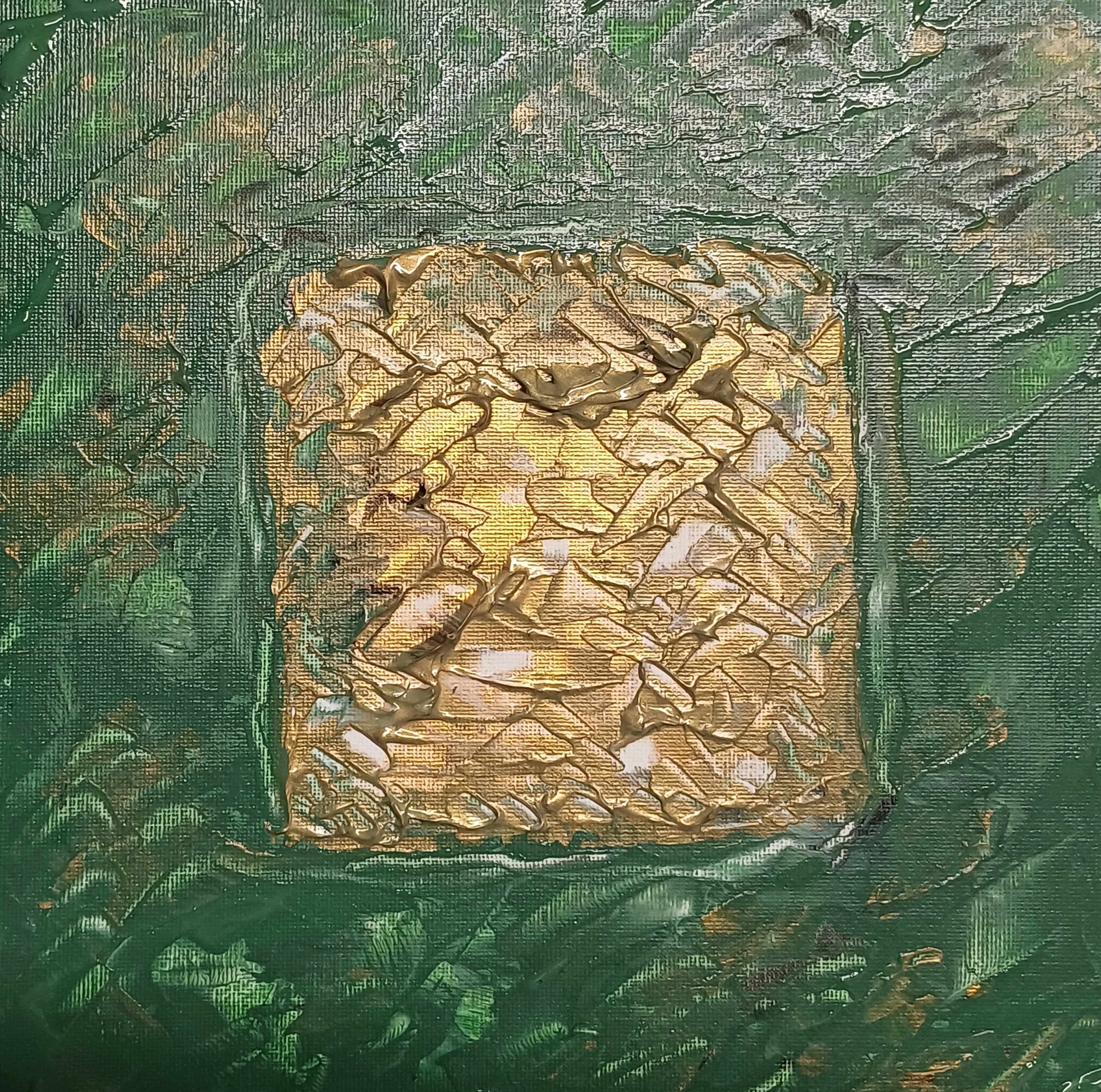
“Gold Squared Green/Gold Tile” [27th March 2024] by Matt The Unfathomable Artist, acrylic fine art painting on 24cm x 24cm canvas board, 3558 x 3649 pixels.
“Gold Squared Green/Gold Tile” shown immediately above was made in one draft immediately after I began “Rectangular Monument Abstract – Painting” [the latter its first draft prior to the dappling effect].
The grey painted square within the green was added to balance the piece. I felt the green was just a little too harsh within the gold. I became immensely focused whilst painting the (finely mixed) opaque grey, enjoying its balancing effect upon the tile.
A eureka sort of experience.
I made a variety of super delicious digital versions I am sharing with you here:
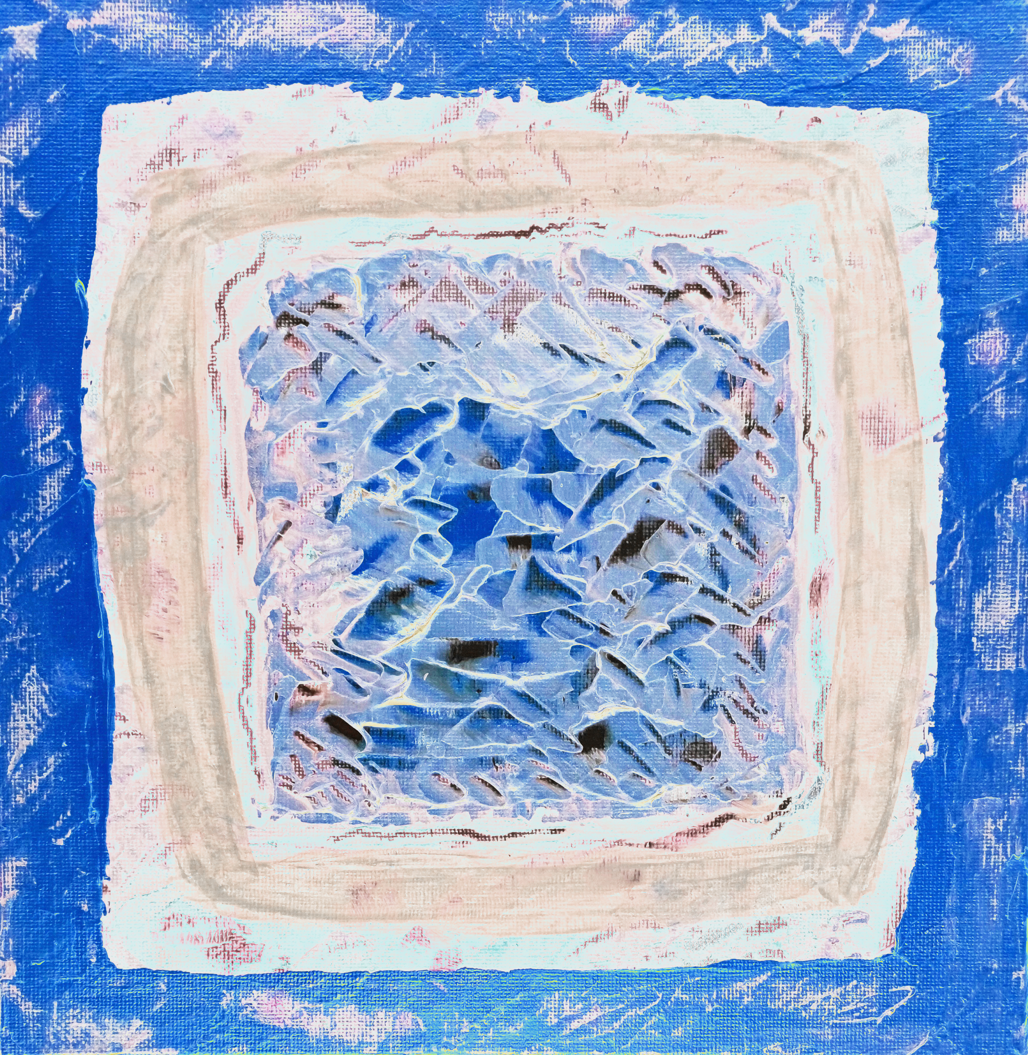
“Gold Squared Green/Gold BLUE Tile” [28th March 2024] by Matt The Unfathomable Artist, Digital Art, 3558 x 3649 pixels.
The beauty of digital works like “Gold Squared Green/Gold BLUE Tile” is that at some time I can make a Pop Art Poster collage version to compliment the various hues :]
“Gold Squared Green/Gold RED Tile” [28th March 2024] by Matt The Unfathomable Artist, Digital Art, 3558 x 3649 pixels.
“Gold Squared Green/Gold RED Tile” is bold and bright.
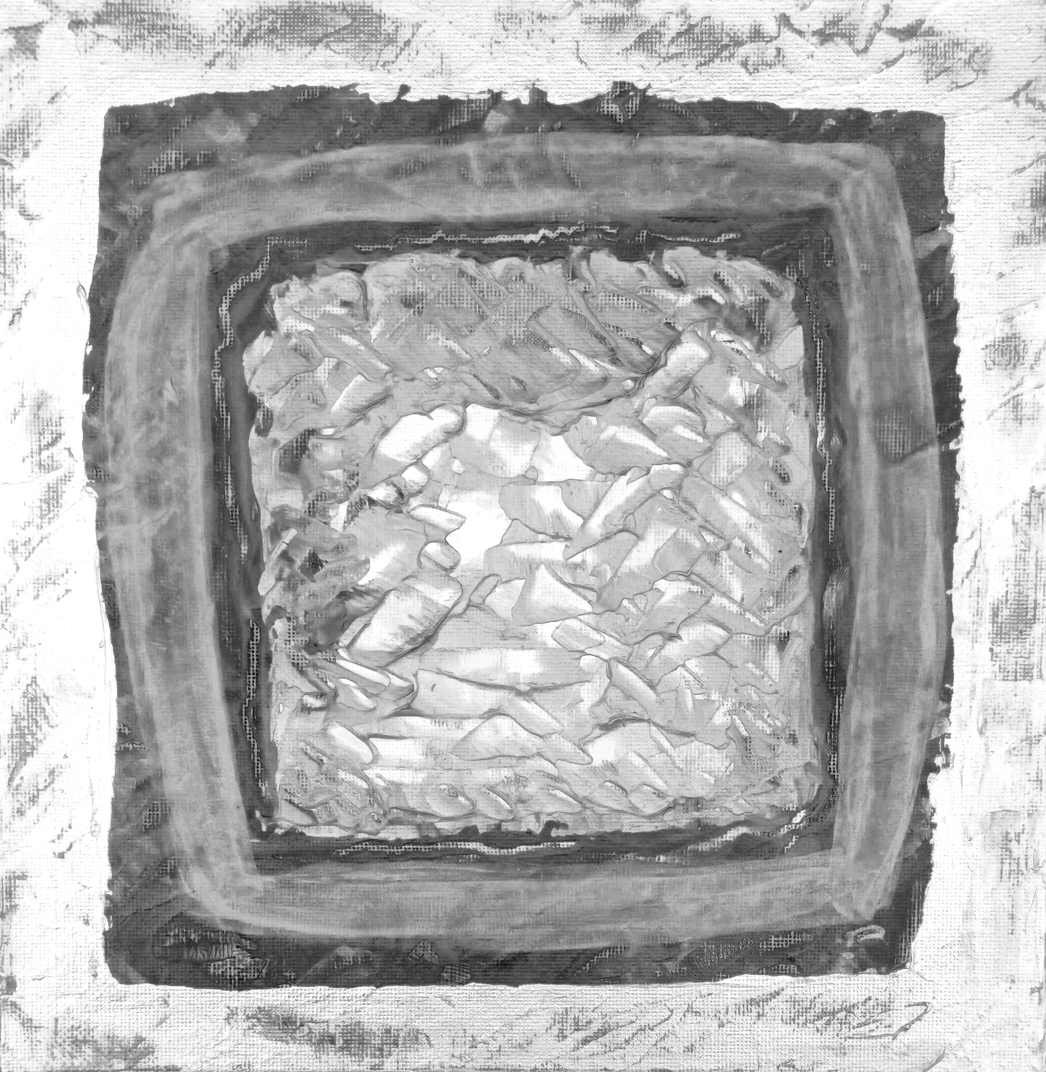
“Gold Squared Green/Gold MONOCHROME Tile” [28th March 2024] by Matt The Unfathomable Artist, Digital Art, 3558 x 3649 pixels.
“Gold Squared Green/Gold MONOCHROME Tile” is quite understated for one of my monochrome works. For me this makes it somewhat unique.
“Gold Squared Green/Gold GREEN Tile” [28th March 2024] by Matt The Unfathomable Artist, Digital Art, 3558 x 3649 pixels.
“Gold Squared Green/Gold GREEN Tile” continues to show the palette knife work at the centre.
“Gold Squared Green/Gold ORANGE Tile” [28th March 2024] by Matt The Unfathomable Artist, Digital Art, 3558 x 3649 pixels.
“Gold Squared Green/Gold ORANGE Tile” is such a lovely colouration I think. I made them in order as follows: Monochrome, Blue, Orange, Red and Green. Interestingly I had tried two digital versions from the original gold tile before returning to make these ones I am very happy with!
Quality really is everything to me as an artist.
Actually I haven’t fully photographed “Pink Monument Abstract” or “Pseudo Purple with Gold Frame” outdoors individually yet due to very rainy days. There were other technical reasons too. Flatness of canvas paper! The paintwork was quite heavy so I needed to remedy this too.
Looking forward to photographing these Rectangles so you can see ultra close up details. Although peering at the Totem just now, even I can see new things in the piece I hadn’t realised before. I will share what I see in a later blog article for you. It will also be interesting if anyone else thought the same.
By the way whilst I’m thinking and writing I can let you know a wonderful thing about “Cyan Palette Nebulae” (yet to be published on my WordPress although you can view this on my Instagram)..
.. it has a face! I didn’t notice this until four days after, whilst (self) admiringly looking at the piece. I literally laughed wondering how I had not noticed this earlier lol.
A similar pure chance happened with “Gold & Blue Abstract after Rothko”! Again, more about this when I write the article for that piece. I made miniature abstracts so quickly I am catching up with my blog writing waiting for less rainy days.
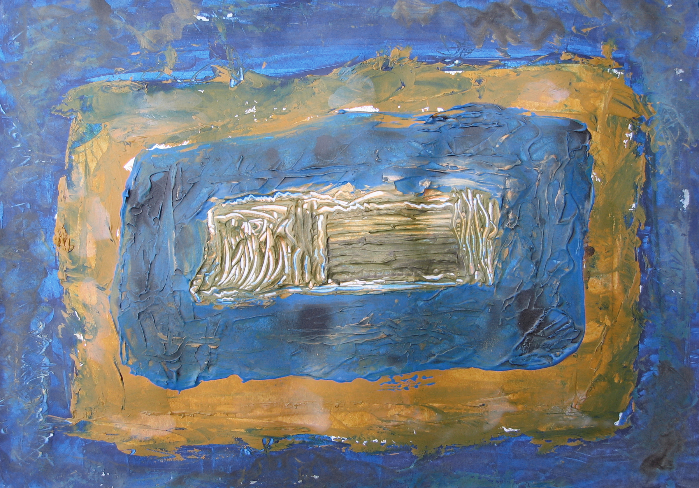
“Rectangular Monument Abstract – Painting” [28th March 2024] by Matt The Unfathomable Artist, acrylic abstract fine art painting on A3 300g mixed media paper, 2326 x 1641 pixels.
Innumerable drafts to make “Rectangular Monument Abstract – Painting”, an artwork somewhat Rothko inspired. It began with cerulean blue then I incorporated a grey wash to soften its harsh vibrance. Very much diffusion over texture for this painting.
Interestingly this painting holds much interest to the viewer. I do not know why.
Photographed indoors due to considerable rain. Digitally balanced whilst comparing the physical painting to this image (shown above) indoors under artificial light.
“Rectangular Monument Abstract – Monochrome” [28th March 2024] by Matt The Unfathomable Artist, acrylic fine art digital painting from original acrylic, 2398 x 1674 pixels image.
“Rectangular Monument Abstract – Monochrome” retains the original textures in the blue painting prior to the grey wash. I will show you the earlier cerulean blue draft at the end of this article.
“Rectangular Monument Abstract – Etching” [28th March 2024] by Matt The Unfathomable Artist, digital artwork from original acrylic, 2326 x 1641 pixels image.
“Rectangular Monument Abstract – Etching” is appreciably named for its likeness to stone etchings. This digital piece is arty enough for me to wish to publish.
Let’s see an earlier draft for this piece in cerulean blue:
“Rectangular Monument Abstract – blue draft [unedited]” [27th March 2024] by Matt The Unfathomable Artist, acrylic abstract draft on A3 300g mixed media paper, 2398 x 1674 pixels.
With “Rectangular Monument Abstract – blue draft [unedited]” you can see the effect of uneven lighting. As regards the physical painting the blue appeared far too harsh off the canvas paper.
Loved the textures, disliked the colour scheme. I personally prefer the latter finalised version. The yellow ochre textures are still present. Furthermore the dappled light effect of the finissimo is better in my opinion, easier to view. The separation between colours more successful, to me anyway.
Besides, the textures are part of the painting – obscured underneath dappled light.
What is the central ‘monument’?
Nothing in particular. Just freestyle palette knife work. Afterwards I had straw or hay in mind as a similarity. True, it is rather ark-like too. It could be one of those intricate 19th Century decorated boxes perhaps.
Imagination is art.
By the way. I often visualise how my work is best displayed. For instance “Rothko x Basquiat Gold/Cerulean Blue” looked wonderful as a tile on the floor. Like the famed stars of Hollywood. I viewed it this way myself! Admiring its golden beauty.
Then for “Pressed Gold Flowers – Painting #1 & #2″ I envisage these fastened front and back inside a natural wooden frame with A3 sized sapphire crystals over each painting! Grandeur I know. Why ever not I say.
Admit it, this would look phenomenal hanging there gently turning from a ceiling with real flowers as its friends.
Imagine viewing “James I IV Oak Branches in Sunlight” placed neatly in a solid box. You peer through the telescopic-like window. The box is lit only by natural UV filtered sunlight at a certain time of day. You can just make out the shadowed branches in the sunlight.