
‘a4 LY’ detail two.
Following on from my last post ‘If Entirely Fathomable, Wouldn’t Be Unfathomable’ I believe this article dignified a detailed look at my ‘a4 LY‘ equation artwork.
Hopefully the macro images on this page will help viewers enjoy the ultra-fine hair line details iron gall ink produces upon good paper.

‘a4 LY’ detail one.
This artwork is purely another experimentation piece, whilst honing specific art ideas. Having perused the ‘Vivaldi script’, I might try this font next.

‘a4 LY’ detail four.
Mid-English numerals from the early 16th Century, mostly, did not include Roman numerals in popular documents. Secretary-hand, postal correspondence or formal representation to my best knowledge.
‘j’ denoted number 1 and ‘iiij’ denoted the number 4 [resource: The National Archives – Paleography UK].
Whilst standardised word spelling and usage of the modern letter j was not widely prevalent through [early] 16th century English writing. Handwriting styles regarding formation of letters could vary quite significantly.
The numerals ‘iiij’ to denote the equation number ‘4‘ is stylised by myself from handwriting research prior to producing this particular work.

‘a4 LY’ detail six.
My artworks can involve natural random elements. The seismographic-like lines within this artwork convey a sense of electricity, waves, sound, oscillation, current, weight and potential resistance.

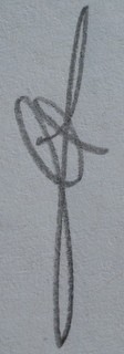
‘a4 LY’ detail three.
In detail three, above, two lines converge at the centre [of this image], reminiscent at least to me of a famous chapel painting. With the conceptual placement of this artwork historically between the 16th century into modern times, I love artistic comparisons.

‘a4 LY’ detail five.
Signed, Matt.
