I have produced a series of Pop Art oil pieces on A3 light textured paper entitled ‘If Entirely Fathomable, Wouldn’t Be Unfathomable’.
Here is the Aquamarine version:
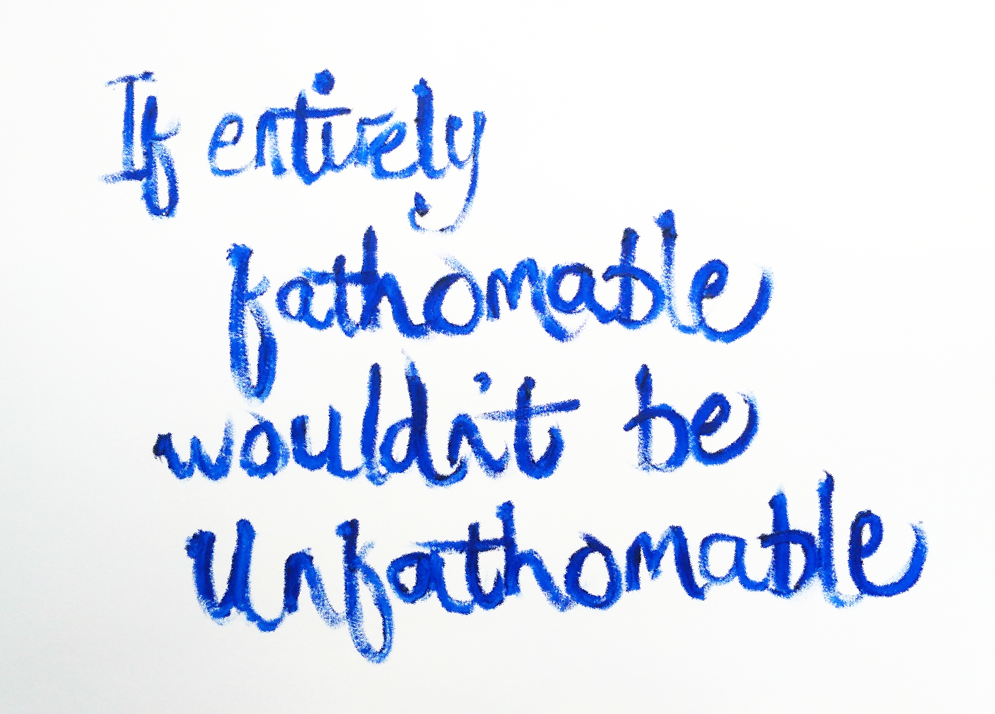
Pop Art ‘If Entirely Fathomable, Wouldn’t Be Unfathomable’ [Aquamarine, 25th April 2019] by Matt The Unfathomable Artist, Aquamarine oil paint writing on A3 light textured paper, signed ‘Matt’ on reverse. Digitally edited photograph. Original Saying created December 2018.
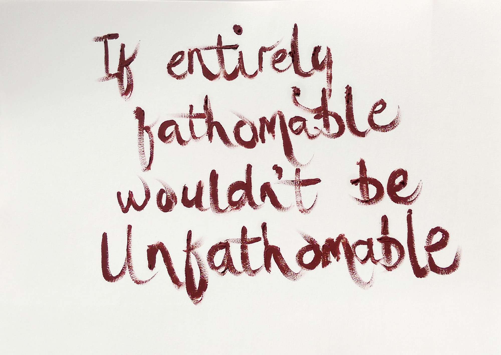
Pop Art ‘If Entirely Fathomable, Wouldn’t Be Unfathomable’ [Red Ochre, 26th April 2019] by Matt The Unfathomable Artist, Red Ochre oil paint writing on A3 light textured paper, signed ‘Matt’ on reverse. Digitally edited photograph. Original Saying created December 2018.
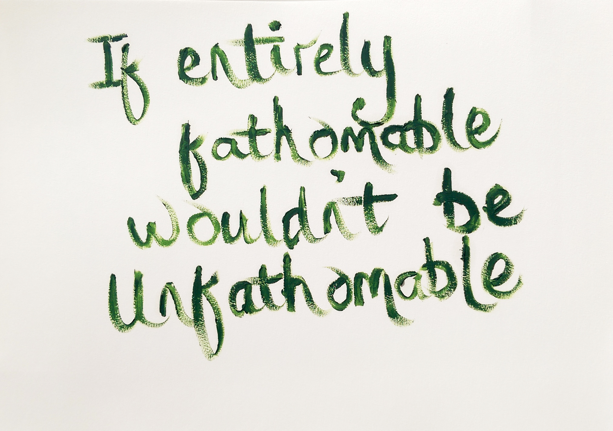
Pop Art ‘If Entirely Fathomable, Wouldn’t Be Unfathomable’ [Sap Green, 26th April 2019] by Matt The Unfathomable Artist, Sap Green oil paint writing on A3 light textured paper, signed ‘Matt’ on reverse. Digitally edited photograph. Original Saying created December 2018.
I like the idea ‘If Entirely Fathomable, Wouldn’t Be Unfathomable’ carries within various layers of meaning. For instance if someone says, we can’t solve this, it’s too difficult, it cannot be done, then we quizzically reply, ‘If Entirely Fathomable, Wouldn’t Be Unfathomable’.
To drive true change we need new behaviour to accomplish whatever is necessary, environmentally speaking. Art can motivate, encourage, nurture, grow, develop and achieve unimaginably positive solutions we just didn’t think possible.
‘If Entirely Fathomable, Wouldn’t Be Unfathomable’.
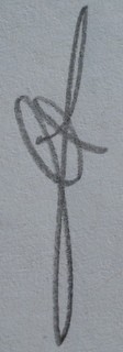
Some have wondered at the random placing of words onto the A3 paper with regards to the use of ‘canvas’ space. Aquamarine naturally aligned centrally. Red Ochre (#1 of #2) shifted right, whilst Sap Green ascended higher textually than the preceding colour oil works.
Perhaps this is the result of pure chance, coincidence. Or possibly preposterously we can read formulaic thinking into the letters. After I completed the art pieces, super happily viewing them drying late evening, I couldn’t help notice the positioning of certain letters:
Y over O in ‘Aquamarine’,
Y intersects B in ‘Red Ochre #1’,
Y is a constant over MA in ‘Sap Green’.
T required calculation.
Likely astronomers, engineers and mathematicians can help explain the correlation to us.
Thank you for reading.
I hope you enjoy my Pop Art works.
