

A fun project featuring “Gold Squared Green/Gold Tile” (top of totem), “Rectangular Monument Abstract [Blue/Gold]” (second top), “Pink Monument Abstract” (third from top) and “Pseudo Purple with Gold Frame” (base of totem).
Please note the latter is not actually purple. It has a green/blue background with gold rectangular frame without a monument at the centre. So named since I mixed blue and red for purple and got green. I made two paintings* with that mix the same evening.
I realised the four paintings would compliment each other in a totem monument after I made “Pink Monument Abstract” and “Pseudo Purple with Gold Frame”.
A completely spontaneous work of art whereby I arranged works on the garden pavement floor to decide upon the best arrangement for the totem.
Here is the originating cropped photograph prior to my editing:

My dream art idea here would be to make the Totem into a four sided standing Totem with a painted steel or aluminium pole base. The head would feature different colours of the gold (see versions below). So too with the three rectangular pieces.. different colour versions (as yet produced I might add).
The sculpture could be oil paint printed onto aluminium or copper. Oh gosh, copper would be a total dream artwork for anyone understanding my idea here.
What height would we make it?
Several feet at least I hope.
Next we have the ‘head’ of the Totem:

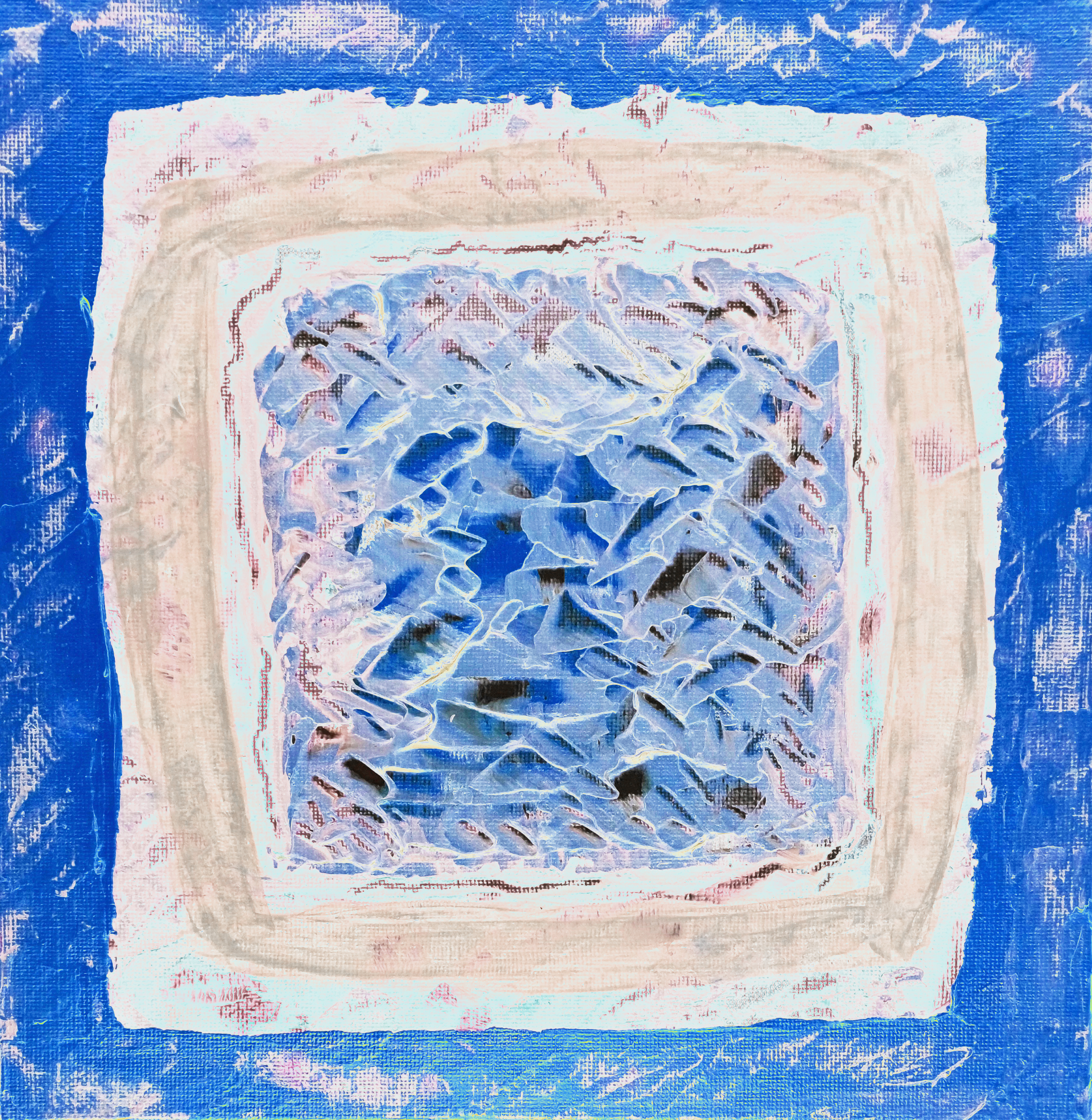
“Gold Squared Green/Gold Tile” shown immediately above was made in one draft immediately after I began “Rectangular Monument Abstract – Painting” [the latter its first draft prior to the dappling effect].
The grey painted square within the green was added to balance the piece. I felt the green was just a little too harsh within the gold. I became immensely focused whilst painting the (finely mixed) opaque grey, enjoying its balancing effect upon the tile.
A eureka sort of experience.
I made a variety of super delicious digital versions I am sharing with you here:
The beauty of digital works like “Gold Squared Green/Gold BLUE Tile” is that at some time I can make a Pop Art Poster collage version to compliment the various hues :]

“Gold Squared Green/Gold RED Tile” is bold and bright.
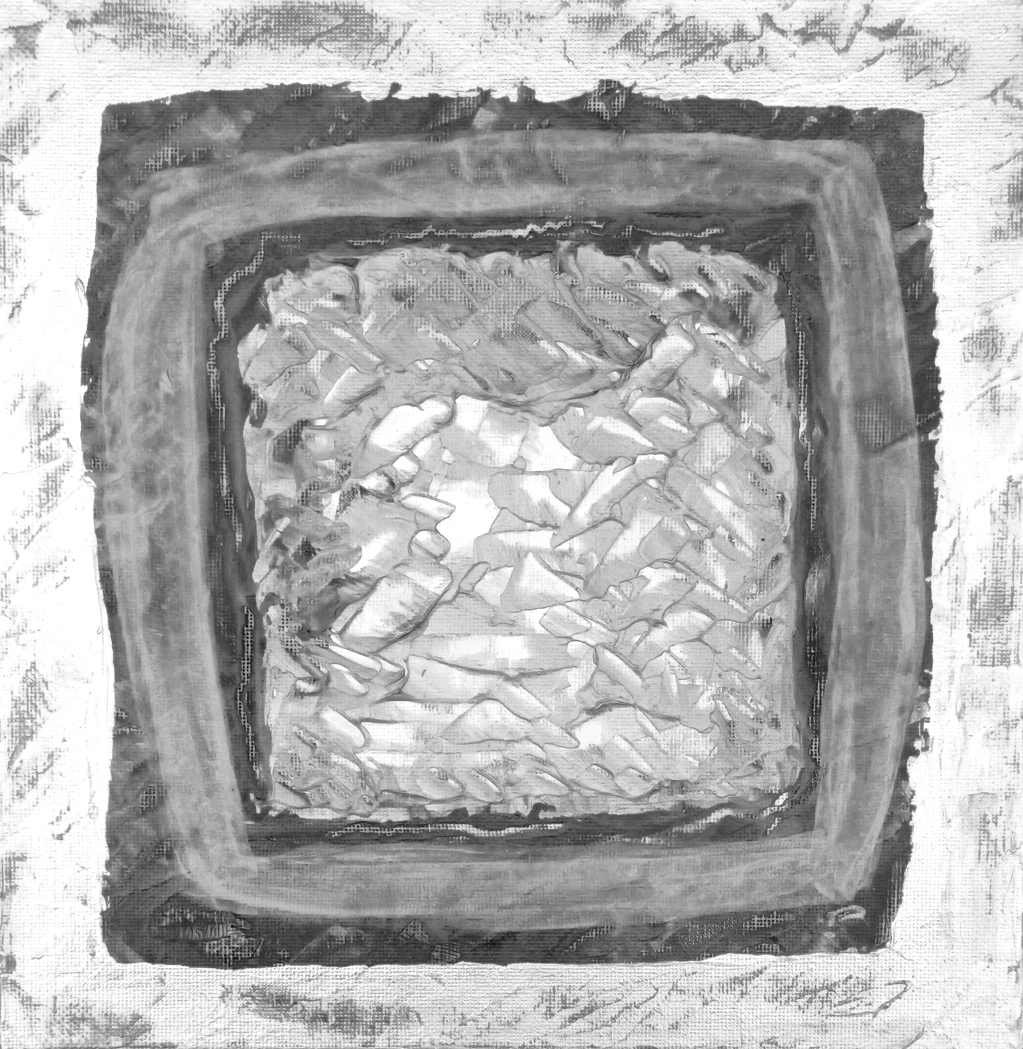
“Gold Squared Green/Gold MONOCHROME Tile” is quite understated for one of my monochrome works. For me this makes it somewhat unique.

“Gold Squared Green/Gold GREEN Tile” continues to show the palette knife work at the centre.

“Gold Squared Green/Gold ORANGE Tile” is such a lovely colouration I think. I made them in order as follows: Monochrome, Blue, Orange, Red and Green. Interestingly I had tried two digital versions from the original gold tile before returning to make these ones I am very happy with!
Quality really is everything to me as an artist.
Actually I haven’t fully photographed “Pink Monument Abstract” or “Pseudo Purple with Gold Frame” outdoors individually yet due to very rainy days. There were other technical reasons too. Flatness of canvas paper! The paintwork was quite heavy so I needed to remedy this too.
Looking forward to photographing these Rectangles so you can see ultra close up details. Although peering at the Totem just now, even I can see new things in the piece I hadn’t realised before. I will share what I see in a later blog article for you. It will also be interesting if anyone else thought the same.
By the way whilst I’m thinking and writing I can let you know a wonderful thing about “Cyan Palette Nebulae” (yet to be published on my WordPress although you can view this on my Instagram)..
.. it has a face! I didn’t notice this until four days after, whilst (self) admiringly looking at the piece. I literally laughed wondering how I had not noticed this earlier lol.
A similar pure chance happened with “Gold & Blue Abstract after Rothko”! Again, more about this when I write the article for that piece. I made miniature abstracts so quickly I am catching up with my blog writing waiting for less rainy days.
Hope you have enjoyed this article.
